It seems the internet is available and useful for everyone...but it isn't. For example, how do blind people navigate the internet? How about those who are color blind? What about those who are hard of hearing or deaf?
There are many considerations you might not have taken into account and could be preventing many people from being able to connect with you and learn more about your business through your website. The good news is, you can change that!
I'm going to break down the aspects of an accessible website through your writing and your design that any beginner could tackle!
Use Informative And Clear Webpage Titles
Whenever you create a page, give it a title (or short name) that describes what that page consists of and differentiates it from other pages. At Wavoto, we require each page has a name, but also provide the ability to include a Page Title for Search Engine Optimization (SEO) that gives you the opportunity to title your page for search, but also those using a screen reader.
You want to make sure your page titles are clear and concise. For example, our "Features" page could be titled "Snazzy Tools", while this is creative, it makes it hard for people to find the answers they're looking for and muddy the water of what the page shares.
Additionally, if you have pages in a series or nested under another, you want to make it clear in the title. If Wavoto had different pages for each of our features or tools, we could title the page "Features: Website" and then "Features: Funnel Builder".
Use Titles Or Headings To Break Up Content
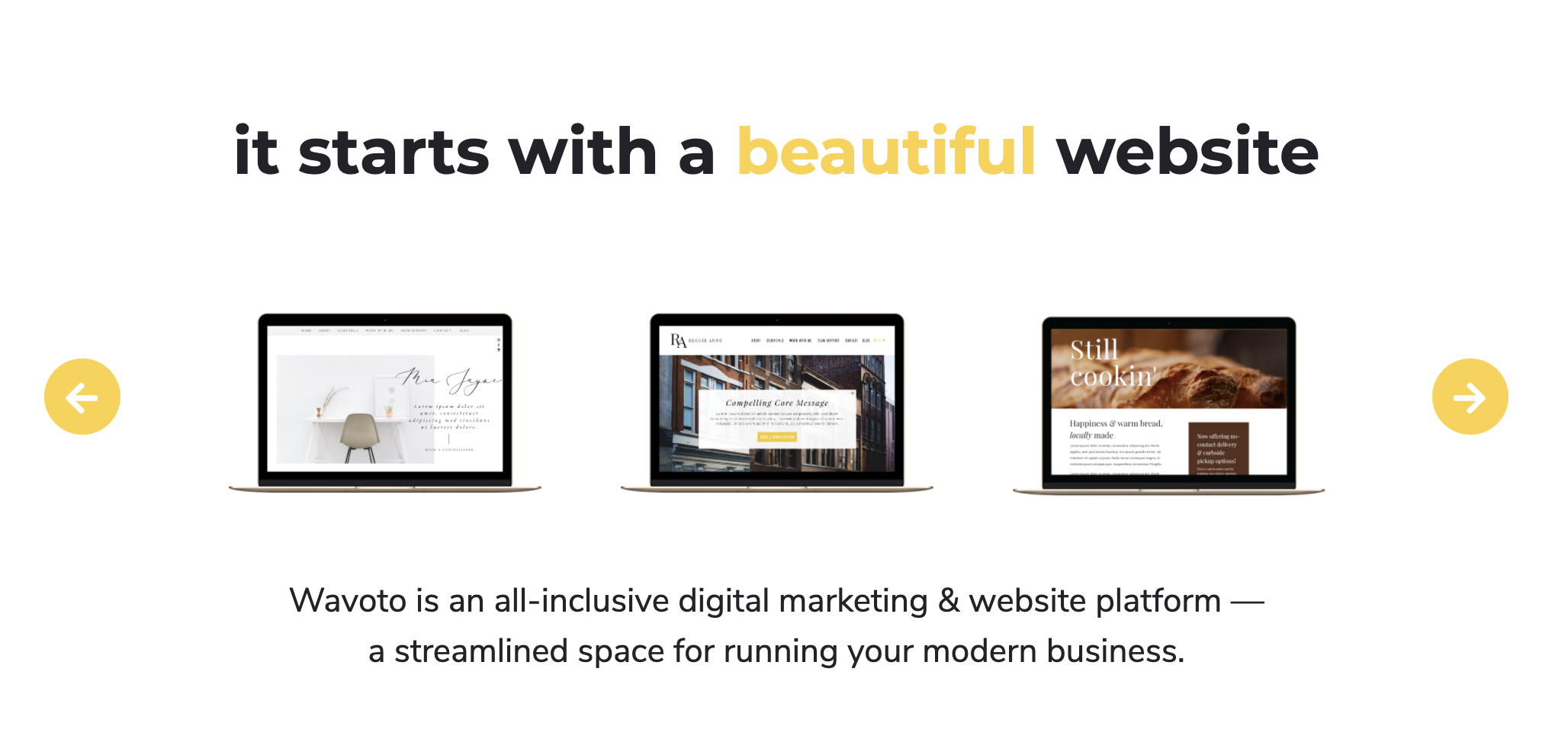
Using titles or headings help to break up content on your website and make it easy to understand. Provide a heading for each section to outline the page and make it easier to navigate. Take a look at two examples of this on the Wavoto homepage:

Make Hyperlinks ClearWhenever you hyperlink something, write what is being linked. While you want to avoid ambiguous text like "click here" or "read more" you also want to make it easy to comprehend and act for everyone. So if you link to another article on a webpage, I recommend putting the hyperlinked text in paratheses like this (
click here to access an article sharing more about website traffic).
While this still uses the ambiguous language, it allows you to make it clear what the action is and how to perform it while sharing what they will access.
Always Fill In Your Alt-Text
For every image, you have the ability to fill in the alternative text, which appears if the image cannot be displayed or someone is using a screen reader. While I often mention alternative text in reference to SEO because it allows another place to highlight any keywords, this is another area where you need to describe what the image is showcasing.
Have Transcripts Or Captions
Whether you have audio or video content, provide a way for people to read the words being spoken, whether through a transcript (you can type up yourself or use a service for) or captions (I like to use Kapwing for this one,
click here to visit Kapwing's website).
Don't Use Complicated Language
When it comes to your website text in general, use simple, to the point language as much as possible. Shorter sentences and paragraphs, avoiding complex words or phrases, and always using the full acronym when it's first used (did you notice SEO stated earlier in this article?).
Simplicity not only makes it easier for anyone, no matter their abilities to access your website, to consume your website content, but it makes it easier for people to comprehend your business and your content. A win-win!
Make Sure There Is Contrast
Have you ever gone to read something and it was too similar of a color to the background? That's what this is touching on. Look at these words, the text is nearly black while the background is white. There is a very clear contrast to differentiate the background from the foreground.
You want to apply this same practice for the text, images, background images, buttons, and other other elements on your website. A good practice to see if there is enough contrast on your website elements is to take a step or two away from your computer and see if the different elements are clear. If they aren't, you may need to change up your contrast colors.
Don't Rely On Color
Color can differentiate many things on your website, but it cannot be the only thing. Use this article, for example, the different headings are larger text, all in lower case and a different color. If they were just a different color, it may be hard for some people to read this article.
Another example of this is why hyperlinked information, not only is it a different color, but it is often underlined or bolded.
Highlight What You Can Interact With
This may feel redundant because it's so similar to "Don't Rely On Color" but many other elements on your website may have interactive abilities such as a form to fill out or a button to click. People know these things are interactive because of how they are designed, whether they change colors when you hover over them with a mouse or they are shaded differently so it's clear you can type into a section. Partner this design with clear naming so people know how to interact with each element.
Have Consistent Navigation Styling
Many websites make this one easy for you, the font and size for each item listed in the navigation are the same and they are positioned in one particular way - easy! What you may not know is that consistent navigation also comes down to how easy it is for your website to be navigated otherwise, i.e. a site map or search functionality. Make sure your website can be searched so if someone is looking for one piece of information, they can find it.
Space Content Appropriately
Similar to how you want to make sure your content has headings, you want to make sure your website elements are appropriately spaced. you'll often hear this referred to as "white space" which refers to empty space that makes it easier to take in the content on the page (this space doesn't necessarily have to be white).
Once again, take a step back from your computer and see if the page looks cluttered or hard to skim - you'll quickly start seeing where you need more space or where there may be too much space!
Provide Controls For Things That Start Automatically
While you may want something to start automatically (a video, audio, or animation) provide a visible way for people to stop it or simply pause it.
Change Up Your Content
Not only is accessibility for those using aids to access your website, but its also about serving those who take in information in different ways. The idea that some people are visual learners, other auditory, while others still can simply read. Supplement your text with images that support your message and caption videos to better connect with your business and you! Never assume one way is the best or only way you need to share information!
As you build your website and are ready to launch it, take a moment to consider each of these accessibility aspects. With Wavoto, we make it easy to make your website accessible for anyone who may be interested in you or your business - see it for yourself by
clicking here to start a free 14-day trial today!
Keeping your website and social media content organized is key to staying consistent. With our
free Content Calendar Template, this process is easy. Manage your content from one place by downloading
today!